Case Study
Component Build
Overview
When not mapping out information architecture concepts, I enjoy exploring intricate interface challenges and crafting versatile, reusable components in Figma to support designers and developers alike.
This case study demonstrates one such component and breaks down the stages involved.

Stage 1 - Intake Acceptance Criteria
List the component’s Content, Construction Notes, and Interactivity Rules.
Content
Construction Notes
- Text: Description
- Tier: 0-3 (indentation level)
- Type Icon: Folder (open/closed) or File
- Security Icon: Shield or Lock
Construction Notes
- Users will stack multiple instances of component.
- Users may create variations using the properties panel.
Interactivity Rules
- Type Icon must be Folder-Open or Folder-Closed if row is a Parent, and:
- Type Icon must be File if row is a Child
This means Folder=Parent and File=Child, so we should separate component variants into distinct Parent/Child categories, so that users don’t disconnect “Folder” from “Parent” and “File” from “Child” (aka, break visual cue) - Security Icons shouldn’t appear by default
Set default boolean value to “false”
Stage 2 - Construct Component
Create ‘subcomponents’ as part of the main component’s adjustable properties, and build variants that reflect the requirements laid out in Content and Rules lists.
Create Icon Subcomponents
![]() Subcomponents can be created in-file, or pulled from the design system library.
Subcomponents can be created in-file, or pulled from the design system library.
 Subcomponents can be created in-file, or pulled from the design system library.
Create Component Variants
![]() Variants contain nested Subcomponents and are organized to reflect UI/UX rules.
Variants contain nested Subcomponents and are organized to reflect UI/UX rules.
 Variants contain nested Subcomponents and are organized to reflect UI/UX rules.
Stage 3 - Utilize Component in Workspace
Bring component into design file, duplicate and modify its properties to build out necessary variations, and insert the final design into larger patterns.
Modify Properties
![]()

Insert Instance and Duplicate
![]()
Stack Variants
![]()

Stack Variants

Insert Stack into Larger Design Pattern
![]() Individual component instances can be freely modified from the stack as needed.
Individual component instances can be freely modified from the stack as needed.
 Individual component instances can be freely modified from the stack as needed.
Let’s get to work.
︎︎

Foundational Work
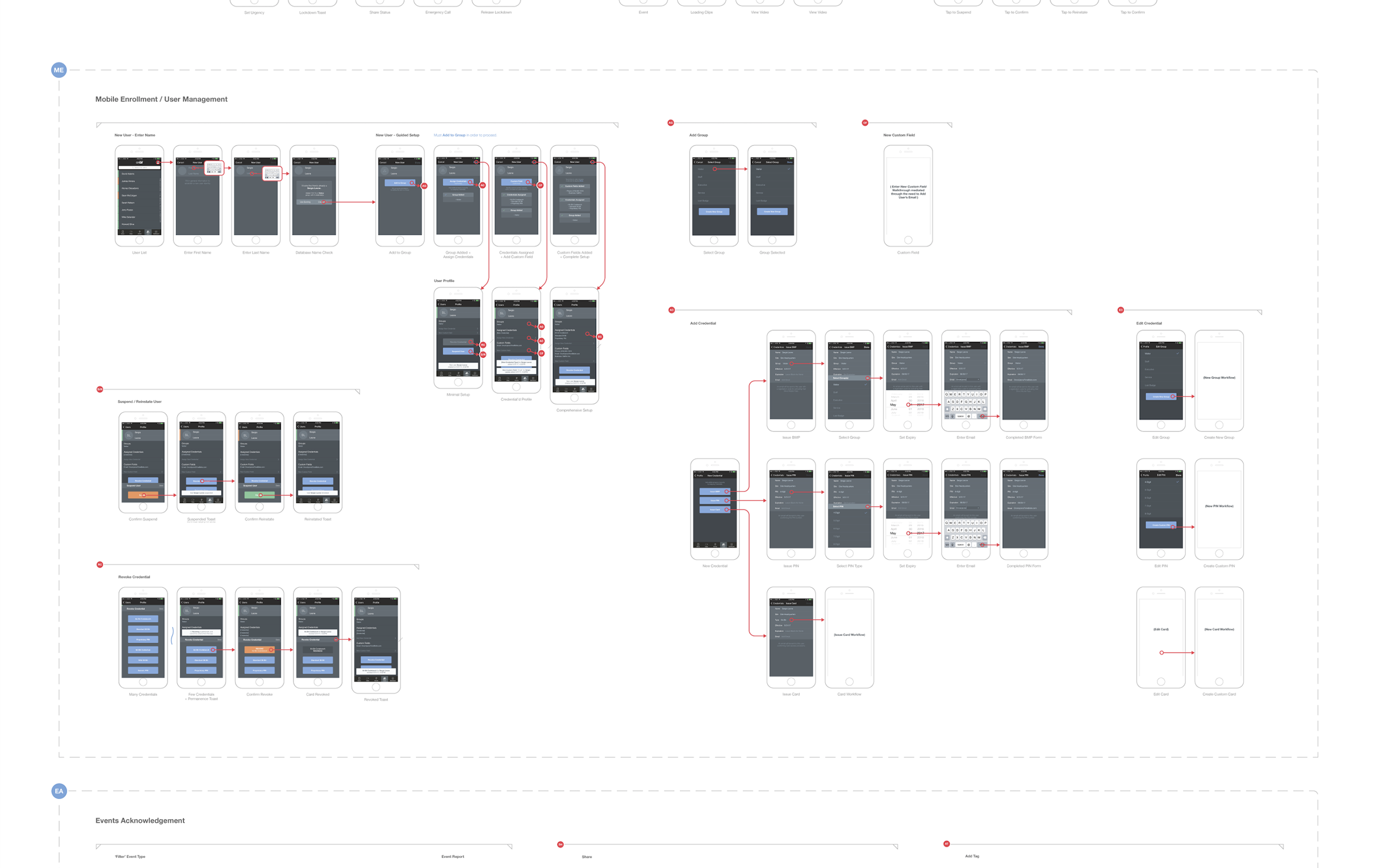
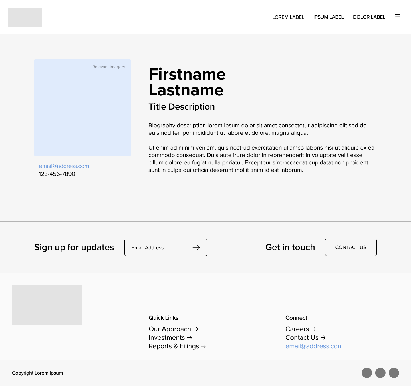
Artifacts, explorations, and a touch of illustration.






UX/UI Process
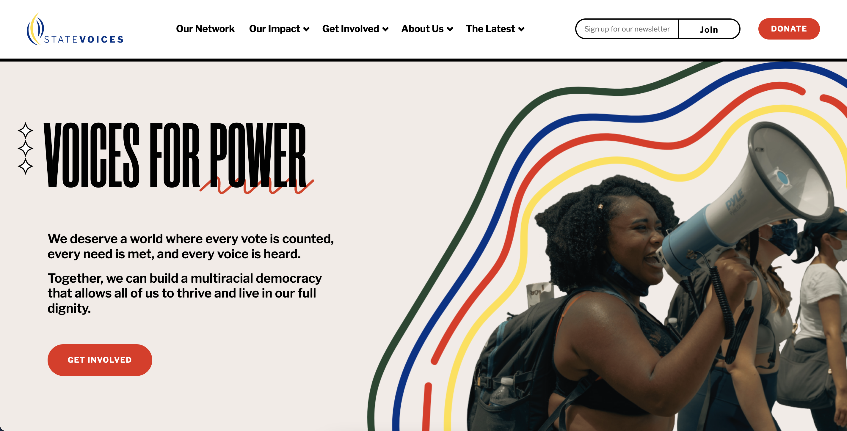
This deep-dive walks through the UX/UI Research and Design process as applied to the African American Alliance of CDFI CEOs Scorecard tool.
Check out the iterative, data-driven UX/UI process where prototypes evolve—through client conversations and internal feedback.
 This foundation has paved the way for recent iterations on the UX/UI process.
© M M X X VI
︎ many thanks to the engineers, developers, strategists, designers, project managers, creative directors, and clients with whom I’ve crossed paths
Foundational Work
Artifacts, explorations, and a touch of illustration.

UX/UI Process
This deep-dive walks through the UX/UI Research and Design process as applied to the African American Alliance of CDFI CEOs Scorecard tool.
Check out the iterative, data-driven UX/UI process where prototypes evolve—through client conversations and internal feedback.
This foundation has paved the way for recent iterations on the UX/UI process.© M M X X VI
︎ many thanks to the engineers, developers, strategists, designers, project managers, creative directors, and clients with whom I’ve crossed paths